
The Art of "BUSHY TALES"

PRESENTATION
From the very first BUSHY TALES strip, it has always been my desire and commitment to present the strip in a very visually and aesthetically pleasing way.
For sure, I want the strip to stand out from others because of its high-quality art, but I also want to make the BUSHY TALES strip a joy to look at simply because I love drawing the Australian bush, the setting for the strip and the characters.
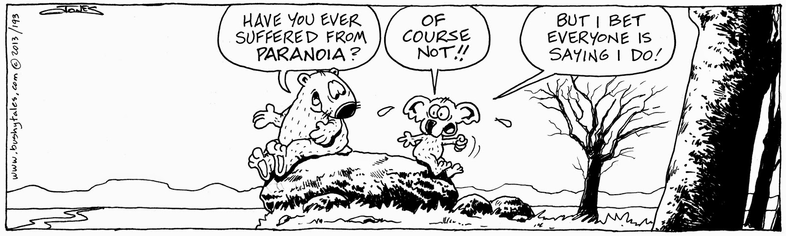
The above image is the title frame from one of the latest BT Sunday strips and it is a good example of how I try to present the strip (I do spend a bit more time on the title frames than other frames where there is action and/or dialogue).
Unfortunately, due to the continually reducing size of comic strips printed in the newspapers, it is a challenge to make a strip "good art" that will not be lost in the reduction, and not just to succumb to using simple line drawings (not that there is anything necessarily wrong with such strips...I just want to do more with BT).
Of course, it never used to be this way......
Of course, it never used to be this way......
Back in the days when newspaper comic strips were valued, not just by readers but by editors as well, things were different. The comics were printed at a size that cartoonists can only dream about these days. There was plenty of room for detail and pictorial story-telling. Sadly, as the competition for column space increased, editors took the view that the comics could easily get smaller (and smaller and smaller and.....).
So, as a way of compensating for the increasing reduction in the printed size of their work, cartoonists (with some exceptions) started to use less detail, background and unnecessary "clutter" in their strips. This was/is a great shame.
One cartoonist in recent times who refused to be contained and confined to the restrictions of space was Bill Watterson with his legendary "Calvin and Hobbes" strip. Watterson made his strip a compelling and overwhelmingly effective argument in support of the view that comic strips COULD BE good art. And his art was way better than just good!
Personally, I think many other cartoonists have followed Watterson's lead and influence (I know I have). These days there are many comic strips that are beautifully crafted and drawn, not just relying on the "talking head" approach of former years.
Next week, I will list some of my favourite comic strips (past and present) and many of these strike that delicate balance between the art and the humour with great success.
It is something that I continue to strive for with BUSHY TALES.
They say that in a comic strip good writing can save bad art, but good art can never save bad writing. So the constant challenge for me (and every cartoonist) is to make sure the balance is in synch and the writing (gag/story) is the priority with the art playing a strong supporting role. It is not always easy, but it is good to have such a criteria to be aiming for....and evaluating with.
PEARLY GATES vs BUSHY TALES
My previous comic strip, PEARLY GATES, and my current strip, BUSHY TALES, are vastly different.
PEARLY GATES was a comic strip based on the age-old gag of St Peter being at the Pearly Gates of heaven. I took the setting and crafted a comic strip that ran continuously every day for almost 20 years.
However, the strip was somewhat limiting from an artistic point of view.
I used to say (and still do) that PEARLY GATES was not an earthly look at heaven but, rather, a heavenly look at earth. One of the reasons for this distinction was that I had no way of knowing what heaven looks like and, even if I did, it would be way beyond my capacity to draw it, anyway! So I didn't try. My characters spent all their time sitting around on the proverbial clouds.
Sometimes, I would switch to a scene down on earth for a bit of variety (and to give me something other than clouds to draw!). But, as much as I loved doing the PG strip, I did find it a rather limiting experience as far as artistic expression goes.

So, with BUSHY TALES, I was definitely looking for something that would allow me to be more creative and expressive.
It is through the colouring that the strip becomes even more of a visual feast and, I hope, a point of attraction and appreciation for readers.
The same strip is shown here in the three different versions....
Black and White (as it is scanned into the computer), Greyscale and Colour.

 As you can see, there is quite a process in the production of each BUSHY TALES comic strip. I think it is worth the effort....I hope you do, too.
Until next week....
Joyfully yours,
Ian
WEBSITE: www.bushytales.com
FACEBOOK: www.facebook.com/BushyTalesComicStrip
PEARLY GATES was a comic strip based on the age-old gag of St Peter being at the Pearly Gates of heaven. I took the setting and crafted a comic strip that ran continuously every day for almost 20 years.
However, the strip was somewhat limiting from an artistic point of view.
I used to say (and still do) that PEARLY GATES was not an earthly look at heaven but, rather, a heavenly look at earth. One of the reasons for this distinction was that I had no way of knowing what heaven looks like and, even if I did, it would be way beyond my capacity to draw it, anyway! So I didn't try. My characters spent all their time sitting around on the proverbial clouds.
Sometimes, I would switch to a scene down on earth for a bit of variety (and to give me something other than clouds to draw!). But, as much as I loved doing the PG strip, I did find it a rather limiting experience as far as artistic expression goes.
So, with BUSHY TALES, I was definitely looking for something that would allow me to be more creative and expressive.
THE PROCESS
These days, many cartoonists use computerized and digital programs to draw their cartoons. I'm not one of them. I guess I am a bit 'old school', but I love the feel of pen on paper.So all the BUSHY TALES strips have been drawn by hand. My hand.
I am always trying to improve my style and, often, I will look back at a strip and think that I could have done it better. I guess that is the ongoing process of development...not just of the cartoon, but also of the cartoonist.
Once I have finished drawing the strip on paper, I then scan the original into the computer and work on the colouring using Photoshop. (It is also in the Photoshop program that I produce a version of the strip in Greyscale.)
I have always been a big believer in cartooning being a black and white medium (in fact, the Australian Cartoonists Association was originally called the Australian Black and White Artists Club), but I must confess that I do really enjoy colouring the strip....it can take almost as long as the original drawing!
It is through the colouring that the strip becomes even more of a visual feast and, I hope, a point of attraction and appreciation for readers.
The same strip is shown here in the three different versions....
Black and White (as it is scanned into the computer), Greyscale and Colour.
QUESTIONS & ANSWERS (Q&A)
In the coming weeks I would like to do a blog full of answers to questions from readers.
So...if you have any questions about BUSHY TALES, or cartooning in general, please send them to: bushweekblog@bushytales.com
So...if you have any questions about BUSHY TALES, or cartooning in general, please send them to: bushweekblog@bushytales.com
I'd love to hear from you.
Until next week....
Joyfully yours,
Ian
FACEBOOK: www.facebook.com/BushyTalesComicStrip

No comments:
Post a Comment